
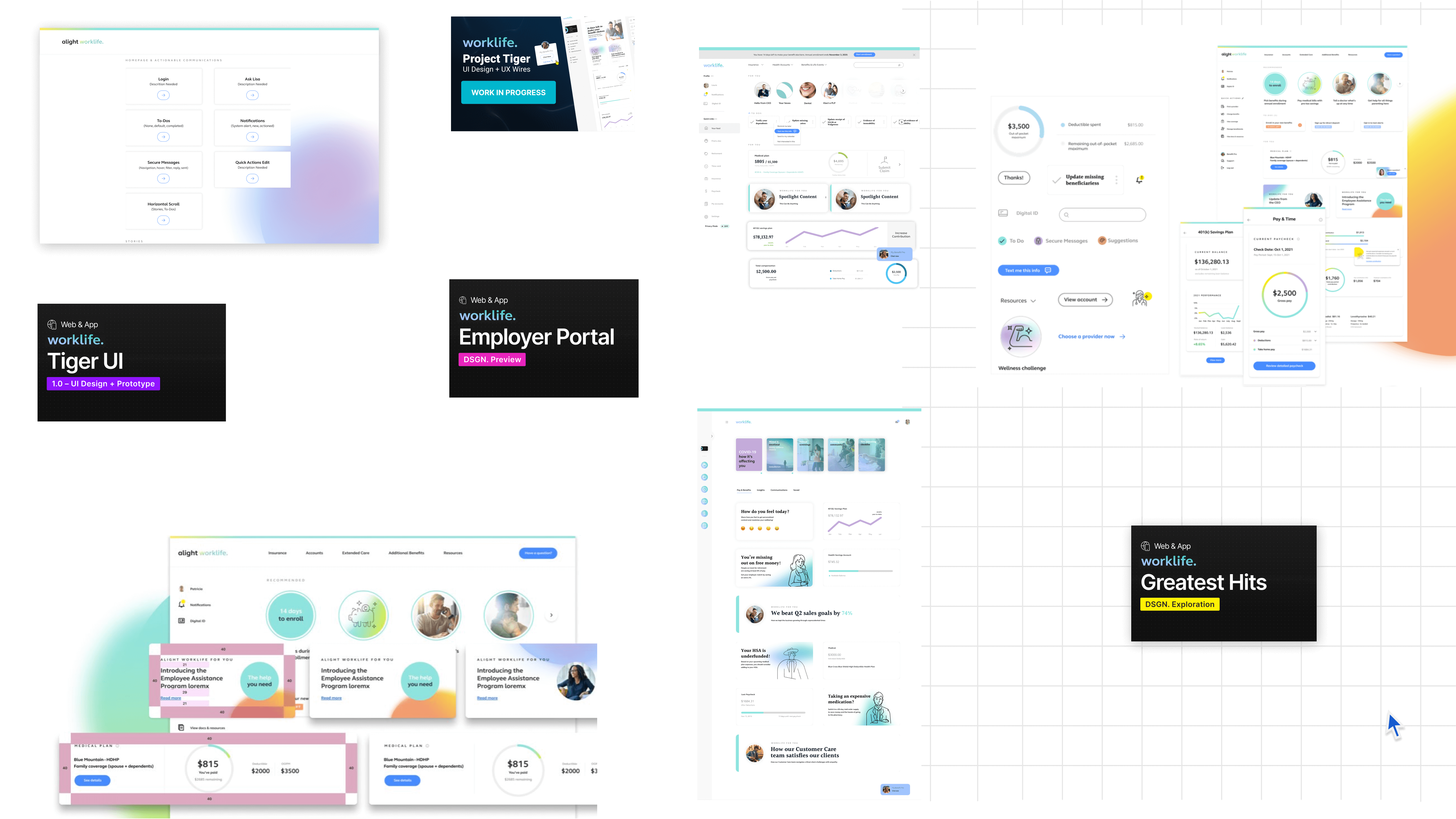
Alight Worklife Design System
Led the design system unifying brand and product across a global HR platform serving 36M+ users. Drove cross-functional alignment across Design, Product, and Engineering, establishing governance and workflows adopted across multiple product teams.
Supporting benefits experiences for 70% of the Fortune 100 required design infrastructure capable of scaling complexity, governance, and consistency across the platform.
Product Design Lead · Design System · Alight Solutions · 2020–2026
The challenge
Restructuring eliminated design specialties while the platform continued to scale, increasing risk of inconsistency and rework.
Approach
Established governance, fidelity decision frameworks, and structured intake processes that turned subjective design decisions into shared, enforceable standards.
Impact
40%
Reduced design rework by resolving fidelity decisions during intake rather than mid-project, shifting design from reactive execution to predictable delivery.

Organizational Structure
- Design systems leadership reported into Product rather than a centralized Design organization
- Distributed team supporting multiple product lines across the platform
- Direct reports included specialized roles such as accessibility experts
- Long-term design partnerships across teams provided continuity and institutional knowledge
Timeline & Scope
- 5 years of active design system development
- Multiple concurrent initiatives: AWLDS interface, modal governance, fidelity frameworks
- Ongoing throughout organizational instability
Tools & Technology
- Figma for design and prototyping
- Jira for backlog and governance
- Storybook for component documentation
- ZeroHeight for design system documentation


💡 Key Learning
Operating without dedicated design leadership required governance artifacts that could defend themselves. Frameworks needed to work asynchronously, be shareable, and defensible without me in the room.
Scope Creep
Inconsistent Expectations
Modal Proliferation
Governance Gaps
🎯 Key Finding
60% of design rework stemmed from fidelity decisions made mid-project rather than during intake. Stakeholders viewed design polish as 'free' rather than understanding the complexity and time investment required.
1. Low Fidelity
2. Medium Fidelity
3. High Fidelity
Polished UI, detailed interactions, animations (24-40+ hours)Formalized an intake process that clarified requirements before design system requests entered the backlog.
- Business impact justification with measurable goals
- Fidelity level selection with stakeholder approval
- Accessibility requirements identified upfront
- Complexity assessment and time estimate

🛡️ Governance Principle
Fidelity decisions are made during project intake and documented in the ticket. Any upgrade in fidelity mid-project is treated as a formal scope change requiring re-estimation.
Foundation
Core Components
Composite Components
Patterns

⚙️ Technical Decision
Built composite components from core primitives rather than creating standalone solutions. This reduced maintenance burden by 60% while increasing consistency.

Rollout Strategy
Foundation tokens and core components (3 months)
Governance frameworks and documentation (2 months)
Complex patterns and adoption support (ongoing)
🤝 Collaboration Win
Office hours attendance dropped 40% after three months, because documentation improved enough that teams could self-serve.
Challenge 1: Resistance to Governance
The Problem:
What Worked:
Challenge 2: Maintaining Quality During Restructuring
The Problem
What Worked
🧠 Operational Insight
Design systems scale when governance and documentation allow teams to make consistent decisions without relying on the design system team.

Reflection
What I'd Do Differently
I would have implemented the intake framework in month 1 rather than year 2. The first year of ad-hoc requests created expectations that were painful to reset later — and the governance work would have been far easier before patterns calcified across teams.
Key Lessons
- Accessibility must be integrated early to ensure inclusive patterns scale
- Naming conventions should align with engineering to reduce friction
- Shared libraries create a common language that accelerates collaboration
Adopted across multiple product teams, establishing shared standards across a platform serving 36M+ users.
The system reduced design rework by 40% and increased design capacity by 35% over five years.
It shifted design from reactive execution to a governed, predictable system, where decisions were made upfront and aligned across teams.
The result was faster delivery, clearer expectations, and consistent outputs at scale.
In Partnership With
DESIGN
3 Designers
COPY
1 Writer
A11Y
2 Accessibility Experts
DEV
3 Engineers
He loves collaborating,
so go on. Reach out.
CONTACT
FOUNDER WORK
FOLLOW
© 2026 Russell Beaver. All rights reserved.