

CLIENT
Maytag (Whirlpool Corporation)
PROJECT
E-commerce Website Redesign
MY ROLE
Associate Creative Director
YEAR
2020
Overview
A website redesign across Maytag’s laundry and kitchen categories, built around reusable templates and a connected shopping experience.
As Associate Creative Director, I set the direction for Maytag’s redesigned experience and helped secure stakeholder buy-in. Throughout the project, I led reviews, presented the work, and worked hands-on with designers, developers, and copywriters to bring it together.
We built reusable templates in Adobe Experience Manager to scale custom pages across laundry and kitchen. I guided how those patterns came together across the experience, staying close to the details while ensuring the pages supported a consistent way to explore, compare, and shop.
Outcome
The templates and custom pages were launched together across laundry and kitchen, providing all teams with shared content blocks for reuse.
CONTEXT & GOALS
Challenge & direction
Maytag’s website was about five years out of date. Different designers and developers had built the landing pages, category pages, and subcategory pages, so they didn’t always look or work like parts of the same site.
We needed to bring those pages together. The goal was to build reusable templates across laundry and kitchen, then make room for custom pages and the details that made each product different.
CORE DESIGN DECISIONS
Product imagery & page structure
We gave the appliances more room with large product images. Then we aligned the page structure: a consistent hero, supporting content, and regional footer blocks. Laundry and kitchen pages followed the same basic flow, with room to show what made each product worth a closer look.
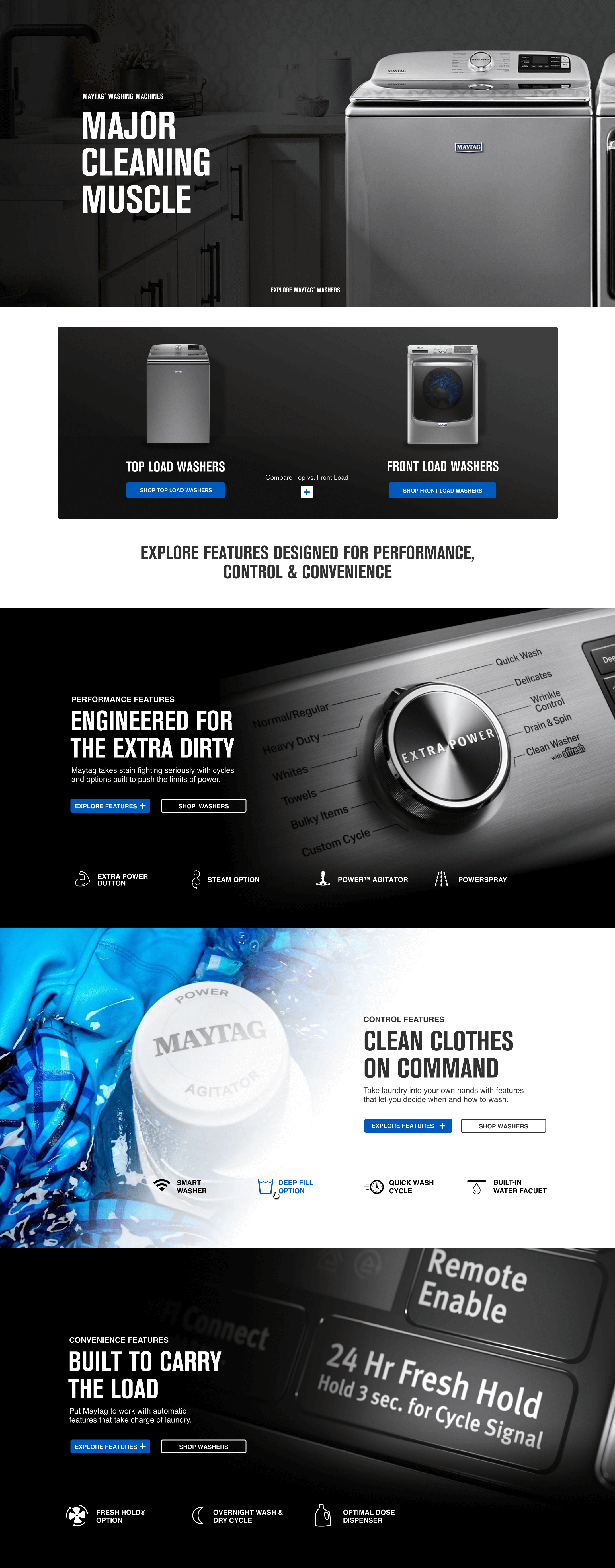
Product features, grouped into cards that are easy to scan.
A consistent look, clear next steps
We used Maytag’s blue, black, and grey palette to bring the pages together, along with consistent type and button styles. Solid brand-color buttons made the main next step clear: “Shop Now” or “View Models.” Outlined buttons gave shoppers other options, like “Compare” or “Learn More.”
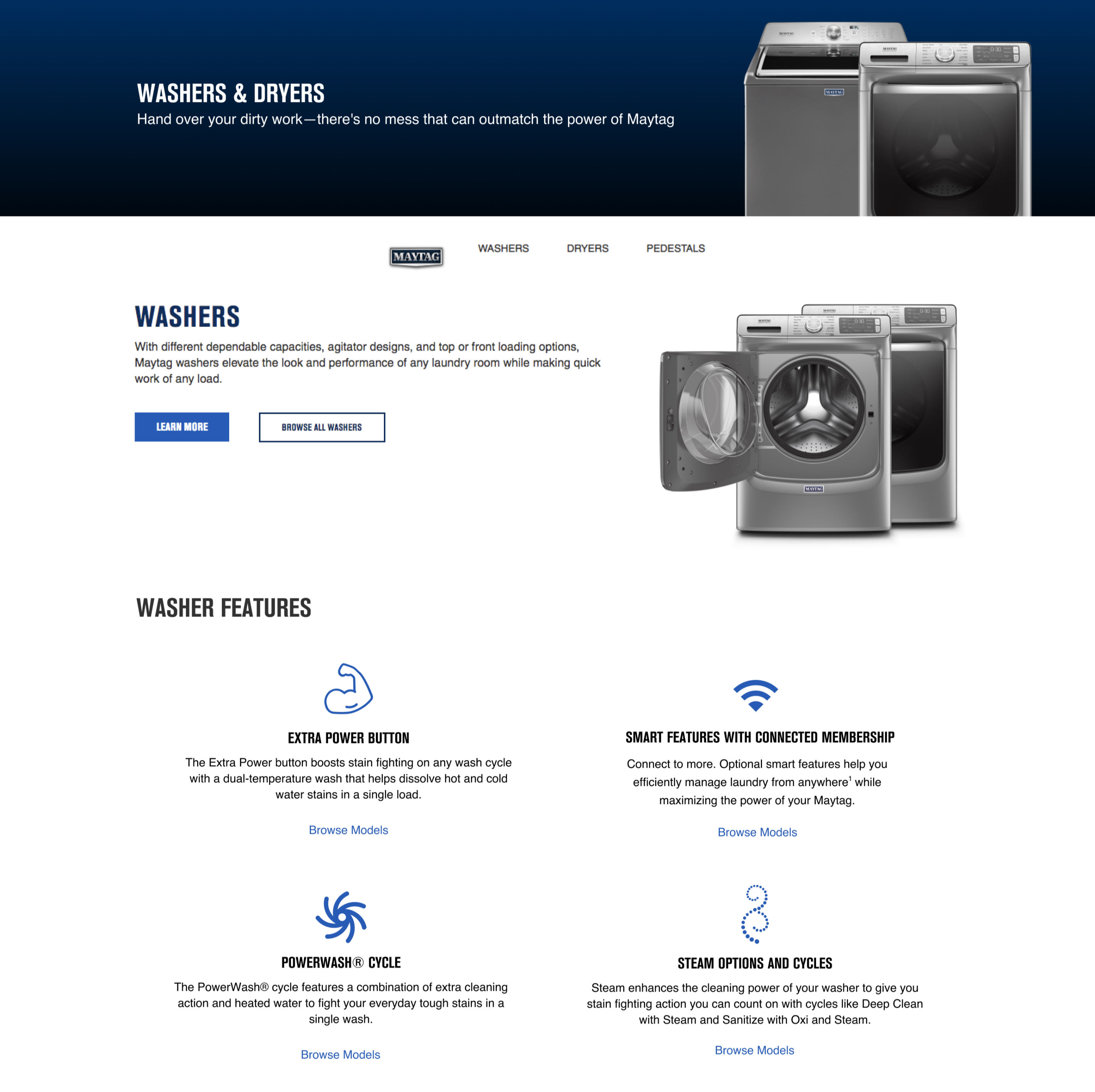
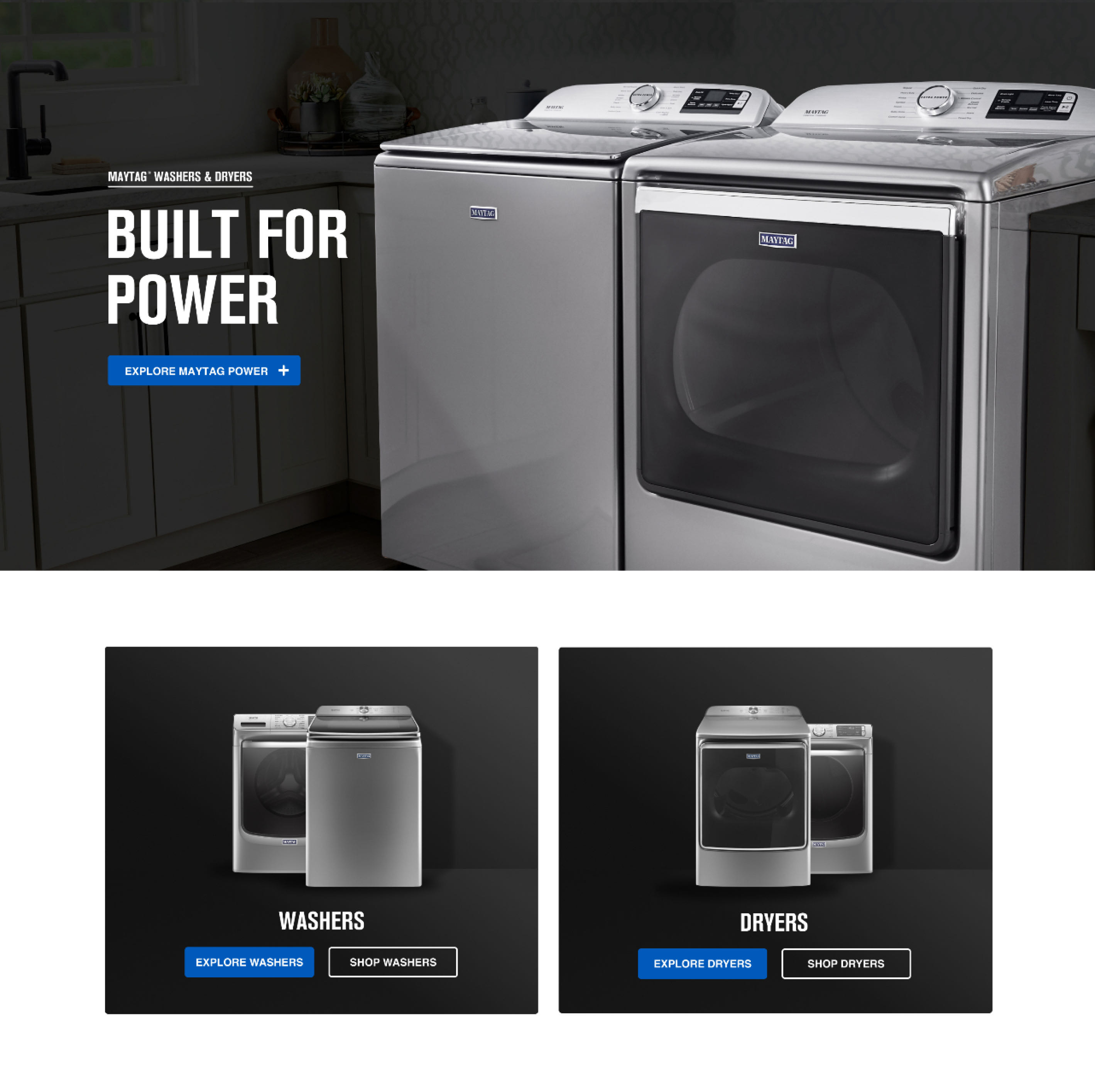
 Drag the slider to compare the old and new pages.
SYSTEM FOUNDATIONS
A reusable design framework
I guided the team toward a framework we could use across the site. Shared page structure, type, buttons, and feature cards gave us a consistent starting point for custom pages in Adobe Experience Manager. In reviews, we looked at how those patterns worked together across laundry and kitchen, with room for each product’s content. A washer and a refrigerator had different stories to tell, but their pages still needed to feel like Maytag.

Foundations and components
We aligned typography, brand colors, buttons, and feature-card variations to create a consistent foundation, helping every page feel connected while giving each category room for its own content.
Different appliances. A familiar experience.
We used the same layouts and content patterns across laundry and kitchen. Each category had its own story, yet shoppers could browse products and explore features in a way that felt familiar.

Same experience. Different screen.
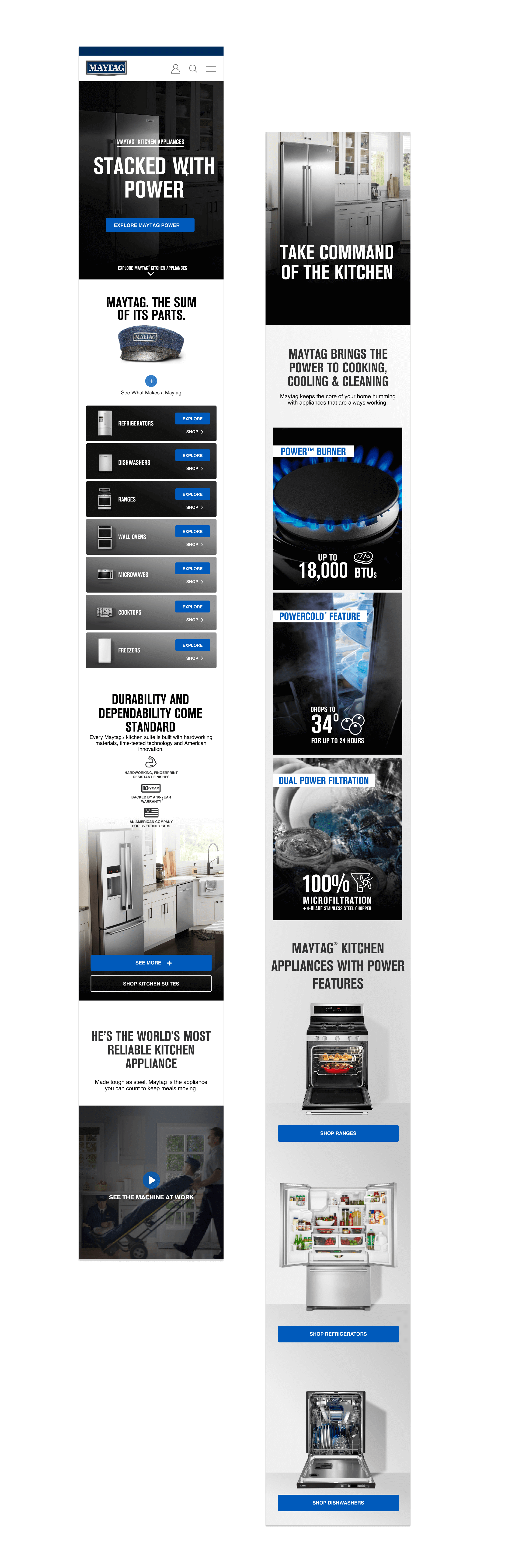
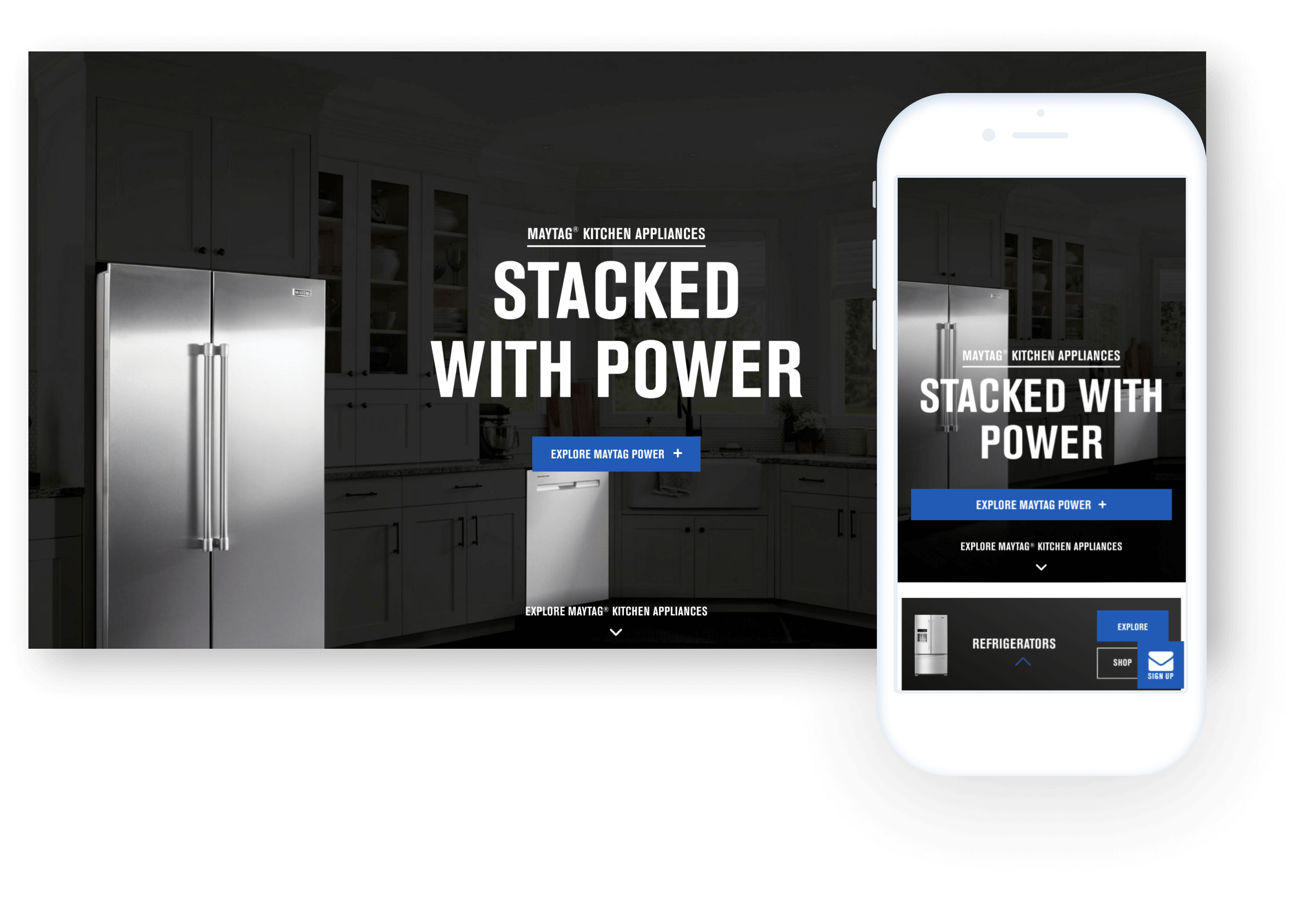
We carried the same patterns from desktop to mobile, adjusting the layout so shoppers could browse appliances, explore features, and find their next step on any screen.
EXPERIENCE & FLOW
Helping shoppers find the right appliance
We used visual cues throughout the navigation. Every category landing page showed thumbnails of the appliance types, so shoppers could see where they were going. Choosing a type took them to its subcategory page, where they could filter the options and narrow down what they wanted.
They could also compare Maytag appliances side by side, looking at the features of each without leaving the experience. That was something we were particularly proud of: giving shoppers a way to work through their options and find the appliance that fit their needs.
We kept the feature cards consistent, down to the padding, image proportions, headings, two-line specs, and warranty badges. The navigation, category menus, and filters followed the same approach across laundry and kitchen, so shoppers had a familiar way to find and scan the details.
CONTENT ARCHITECTURE
The full product story
We worked with a copywriter to bring Maytag’s story and product promises to the category pages: powerful cleaning, a 10-year limited parts warranty, and Maytag Commercial Technology. Shoppers could expand those callouts to learn what each meant and see it in action.
Within laundry, that meant exploring features like Extra Power and pet-focused systems through video and product photography. We linked those features to the models that offered them, so shoppers could move from learning about a feature to finding an appliance with it.
We also focused on how the content opened and flowed. Icons let shoppers jump between topics, while subtle animations and gradually loading content set a deliberate pace. We wanted people to explore as much as they needed without feeling overwhelmed or losing their place.
Every appliance page brought the details together: a clear outline of its features, beautiful product photography, an overview, specifications, reviews, where to buy, and owner’s manuals. We wanted shoppers to have all the information in one place, so they could understand the appliance and make an informed choice.
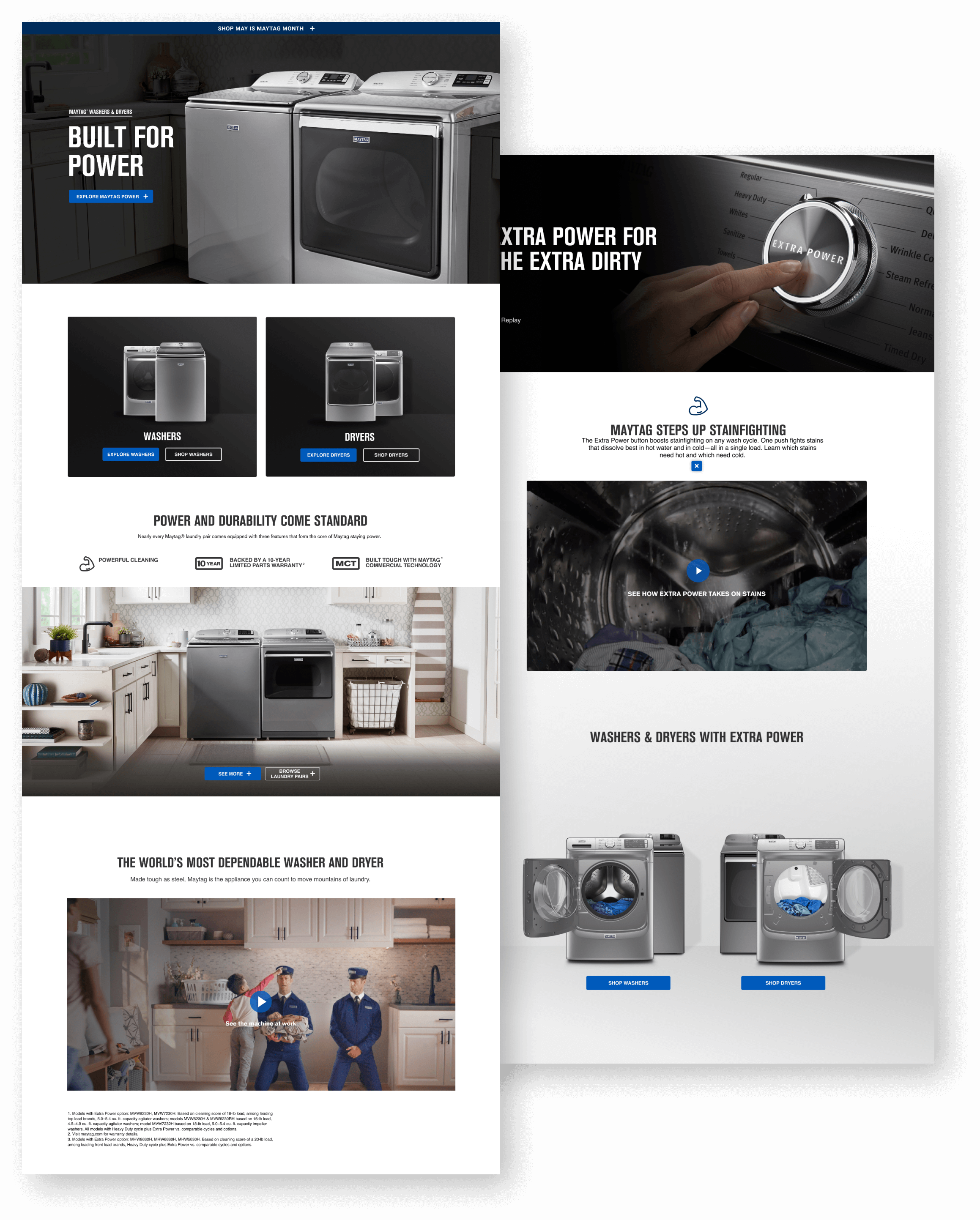
Expand a feature, see how it works, and find the models that offer it.
Responsive across screens
The pages needed to work just as well on a phone as on a desktop. We adjusted the layouts for each screen while keeping the content, type hierarchy, and next steps consistent. I worked with designers and developers to check the custom pages and make sure the details held up at different sizes.
Outcomes
The templates and custom pages launched together across laundry and kitchen. Regional teams could reuse the same content blocks to build product pages, rather than starting from a new design each time.
Live site updated since launch. Core structure and components are still in place.
Lessons
We also learned where the patterns needed flexibility. The feature cards worked well for individual appliances, but kitchen-suite pages had more content to fit in. Feedback led us to adjust the spacing so those pages didn’t feel crowded. The framework gave us consistency while leaving room to make the right call for each page.
The team
DESIGN
2 Designers
COPY
2 Writers
A11Y
1 Accessibility Expert
DEV
4 Engineers

I love collaborating,
so go on. Reach out.
CONTACT
FOLLOW
RESUME
available upon request
FOUNDER WORK
© 2026 Russell Beaver. All rights reserved.